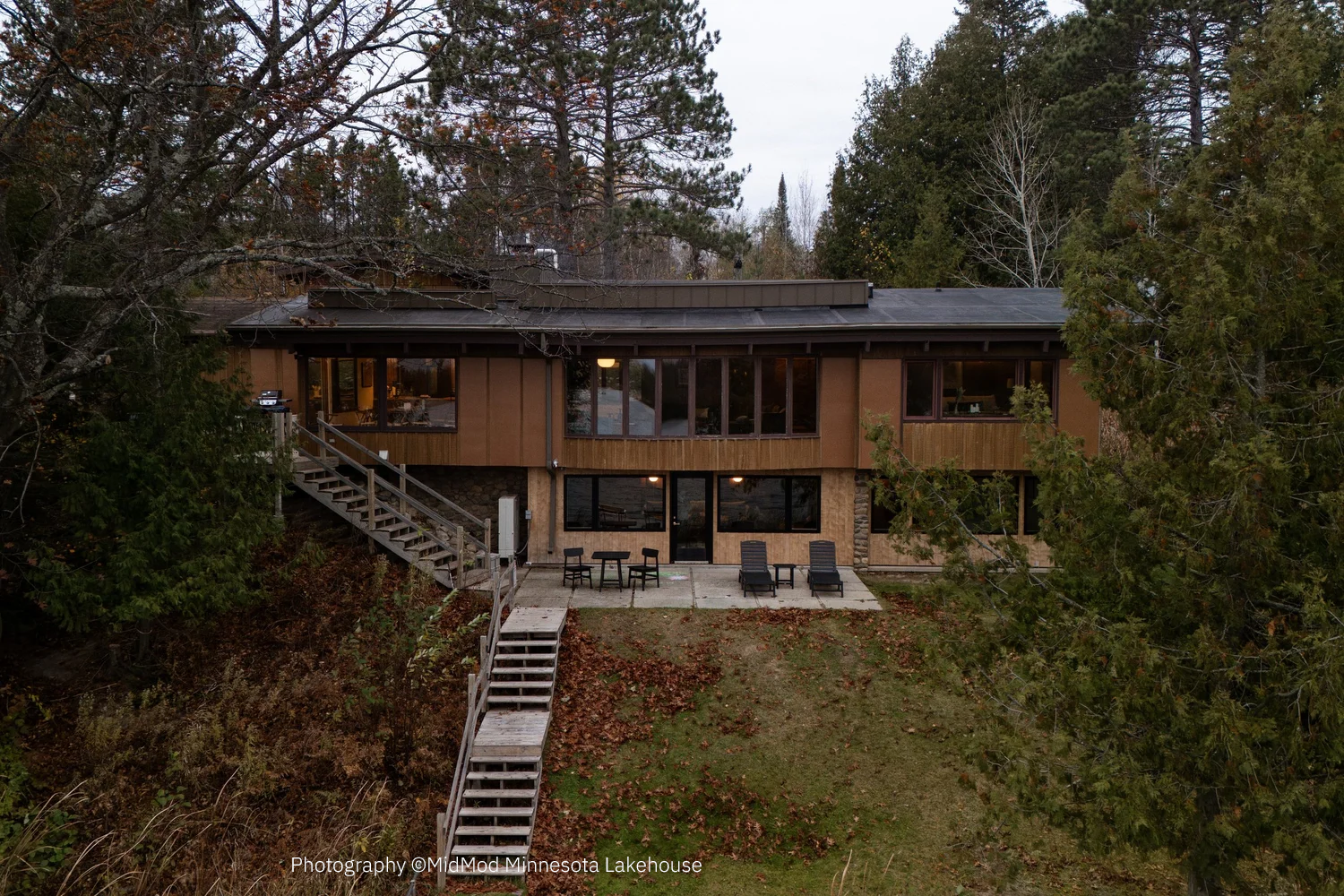
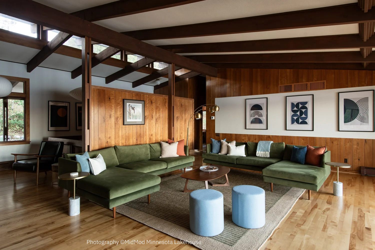
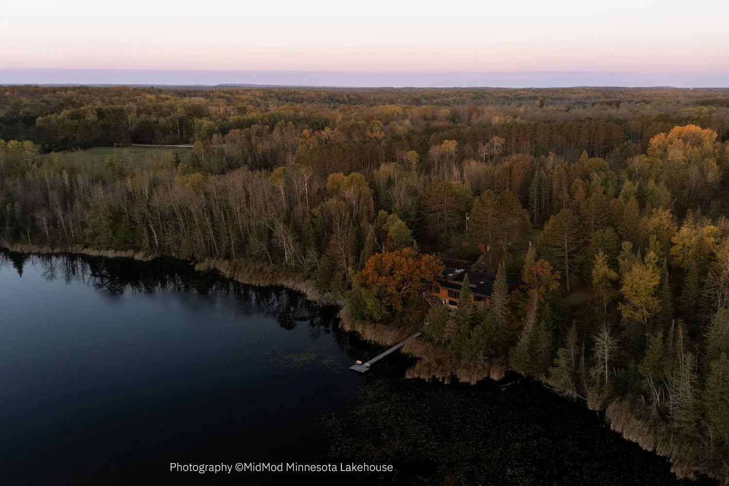
Mid-century modernism was more than just a look; it was about a feeling of progress, simplicity and connection to the environment. For the MidMod project, the challenge was to take those historic cues and translate them into an integrated system where the brand and physical space become one. By combining clean, geometric forms with intentional material choices and a purely Minnesota-nice voice, the signage speaks to a modern audience with a wink and a nod. Coming soon…